
14th April 2022, Kathmandu
Foodmandu, a pioneer in Nepali food delivery services, has unveiled a new brand visual identity.
A completely new and distinct identity represents their history of pioneering new ideas. The rebrand aims to reflect the start of the new era of Foodmandu with a fun, brighter, and friendlier approach to its visual identity, promising a new beginning and more to come ahead.
“We believe that it is important to stay true to our core values and motives. Our new visual identity echoes this emotion. We’re treating this as the beginning of a new era for us—something fresh but also truly us at heart,” says Manohar Adhikari, Founder, and Managing Director, of Foodmandu.
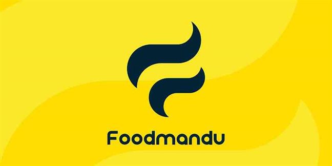
The new logo features a wavy symbol representing steam, meant to signify the happy experience Foodmandu users get from eating delicious hot food. Two streaks of vapor come together to form an “F” letterform in the new icon.
Regarding the new color choices, Shyam Ratna Mali, Foodmandu’s Head of Brand and Marketing, explains,
“Yellow has been chosen as the main brand color. It represents enthusiasm, happiness, cheerfulness, and fun, all things we deem necessary in our relationship with our customers. Our secondary brand color, Prussian Blue, represents commitment and dedication to the service we provide.”
“Moving away from our traditional red and green colors wasn’t an easy decision, but we felt that it was time for a change. We have chosen colors that would best represent the brand going forward,” he added.
Established in 2010, Foodmandu is Nepal’s first and most popular food delivery company. It provides food delivery service from over 800 restaurants to its 350K+ customer base in Kathmandu, Lalitpur, Kirtipur, Bhaktapur, and Pokhara. In addition to food delivery, Foodmandu also offers fresh grocery and beverage delivery services through its separate verticals, Foodmandu Fresh and Foodmandu Bar.