Toyota Drops Wordmark and Reveals New Logo
22nd July 2020, Kathmandu
The trend is real folks! Brand after brand, all significant players in the Auto car business are revealing their new logos. Just a few days ago, we were discussing Nissan’s new logo and them joining the flat design party, and now here we have – Toyota!
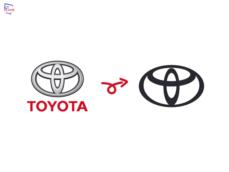
But there is a bigger catch! The new logo is not just modern, simple, and monochromatic, but it’s bold. How? Toyota is dropping away from its red wordmark that you can see in its previous logo.

Toyota previous logo| Image Credit: Toyota
This bold move is a symbol of the brand’s power and its future. Very few companies can pull such a move. Just like Apple and Nike, Toyota no more needs a wordmark in its brand voice.
This is Toyota’s first redesign since 2009, and The&Partnership does this logo design.
This new flat, two-dimensional design will help Toyota to sparkle seamlessly into its digital future.
Toyota new logo
What do you think of the new minimalistic logo? Do you like the brand’s decision to drop its word mark “Toyota” from the logo?


